Building on top of matplotlib#
Read in Datasets#
WAS 2020 Data
Subset of an AVIRIS image
import pandas as pd
import rasterio
# Import example WAS data
was_2020_filepath = "./data/SARP 2020 final.xlsx"
was_2020 = pd.read_excel(was_2020_filepath, "INPUT", skipfooter=7)
# Import example AVIRIS data
with rasterio.open('./data/subset_f180628t01p00r02_corr_v1k1_img') as src:
    metadata = src.meta
    bands = src.read()
Accessing the matplotlib in pandas#
pandas’ plotting tutorial. Useful for reference or for skimming to see more of what the library can do.
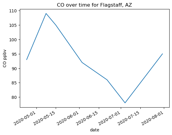
# Processing the dataframe
flagstaff_co = was_2020[was_2020['Location'] == 'Mars Hill/Lowell Observatory, Flagstaff, Arizona'][['Date', 'CO (ppbv)', 'CH4 (ppmv height)']]
flagstaff_co = flagstaff_co.set_index('Date')
# Making the plot
# !! Notice that DATAFRAME.plot() returns an axes object !!
ax = flagstaff_co['CO (ppbv)'].plot(xlabel='date', ylabel='CO ppbv')
ax.set_title('CO over time for Flagstaff, AZ')
Text(0.5, 1.0, 'CO over time for Flagstaff, AZ')
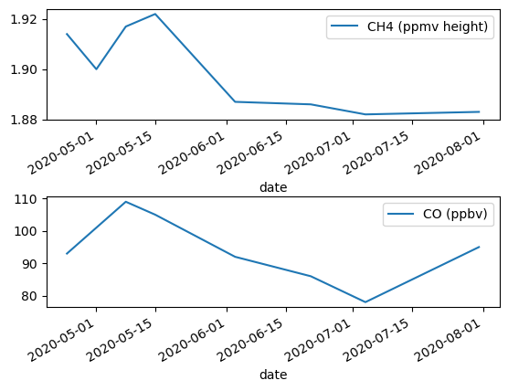
import matplotlib.pyplot as plt
# We can set our pandas dataframe inside a subplot created with matplotlib
fig, (ax1, ax2) = plt.subplots(2, 1)
flagstaff_co.plot(y='CH4 (ppmv height)', ax=ax1, xlabel='date')
flagstaff_co.plot(y='CO (ppbv)', ax=ax2, xlabel='date')
fig.subplots_adjust(hspace=0.7)  # Add more space between plots for labels
Scatter plot example#
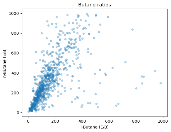
import numpy as np
# Prepare the data
was_2020[(was_2020['n-Butane (E/B)'] < 0) | (was_2020['n-Butane (E/B)'] > 1000)]  = np.NaN
was_2020[(was_2020['i-Butane (E/B)'] < 0) | (was_2020['i-Butane (E/B)'] > 1000)]  = np.NaN
alpha sets the opacity of the points, meaning that it dictates how much you can see through them. I like using it on scatter plots becuase it helps see better the density of points when they are overlapping.
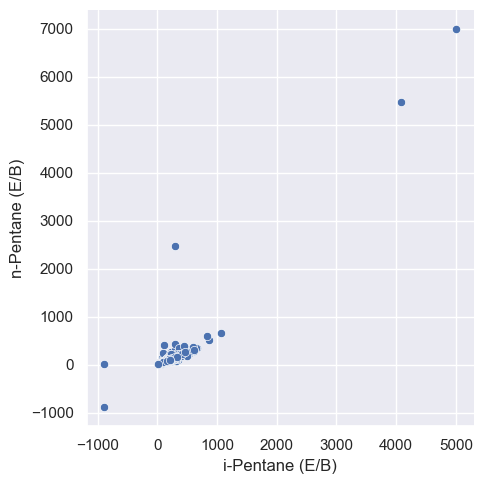
was_2020.plot.scatter(x='i-Butane (E/B)', y='n-Butane (E/B)', alpha=0.3)
plt.title('Butane ratios')
Text(0.5, 1.0, 'Butane ratios')
was_2020.plot()
<Axes: >
seaborn#
Trading control for ease#
matplotlib really lets you do most anything you can imagine to plots. While the control is nice you don’t always need it. If instead you are interested in making plots faster, you might use the library seaborn.
Note: seaborn is most useful if you are using data in a pandas dataframe. Creating plots from seaborn for numpy matrices is totally fine, but you don’t get the same level of benefit as you do with column labelled pandas data.
Installation#
conda install -c conda-forge -n lessons seaborn --yes
Feature: known for built in statistics support
Links#
Nice tutorial section, seperated by need: https://seaborn.pydata.org/tutorial.html
Example gallery also great for inspiration: https://seaborn.pydata.org/examples/index.html
A list of plot types based on data: https://seaborn.pydata.org/api.html#api-reference
import seaborn as sns
sns.set_theme()
Example with a pandas dataframe#
relplotdocs page
# Organizing the dataframe
was_2020_subset = was_2020[(was_2020['Weather'] == 'Cloudy') | (was_2020['Weather'] == 'clear')]
# Plotting with axis labels in one line
sns.relplot(data=was_2020_subset, x='i-Pentane (E/B)', y='n-Pentane (E/B)')
/Users/rwegener/miniconda3/envs/sarp/lib/python3.10/site-packages/seaborn/axisgrid.py:118: UserWarning: The figure layout has changed to tight
  self._figure.tight_layout(*args, **kwargs)
<seaborn.axisgrid.FacetGrid at 0x164cea620>
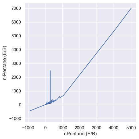
# A line plot version
sns.relplot(data=was_2020_subset, x='i-Pentane (E/B)', y='n-Pentane (E/B)', kind='line')
/Users/rwegener/miniconda3/envs/sarp/lib/python3.10/site-packages/seaborn/axisgrid.py:118: UserWarning: The figure layout has changed to tight
  self._figure.tight_layout(*args, **kwargs)
<seaborn.axisgrid.FacetGrid at 0x164e8af20>
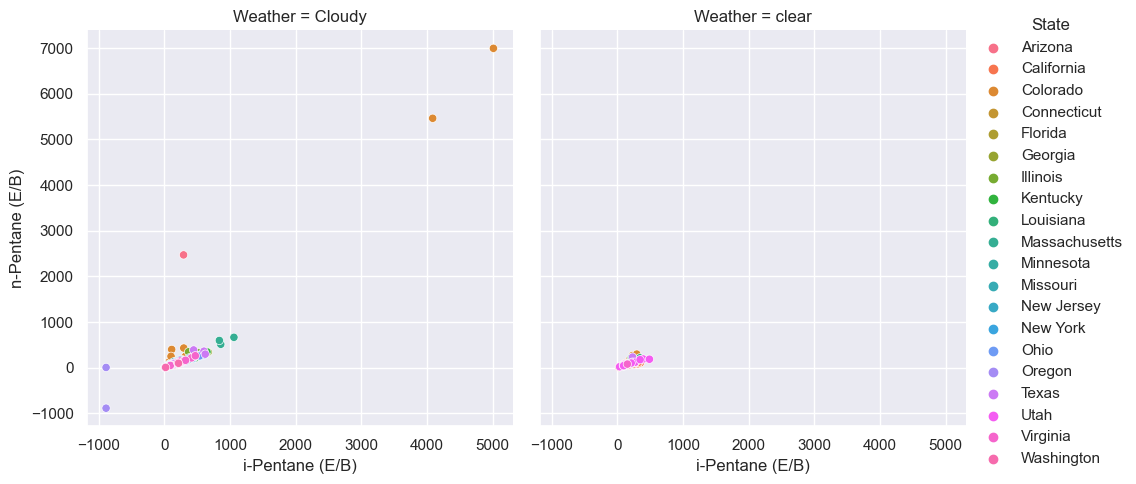
# Adding colors, sizes, and comparison graphs based on additional columns of the dataframe
sns.relplot(data=was_2020_subset, x='i-Pentane (E/B)', y='n-Pentane (E/B)', hue='State',
           col='Weather')
/Users/rwegener/miniconda3/envs/sarp/lib/python3.10/site-packages/seaborn/axisgrid.py:118: UserWarning: The figure layout has changed to tight
  self._figure.tight_layout(*args, **kwargs)
<seaborn.axisgrid.FacetGrid at 0x164eed870>
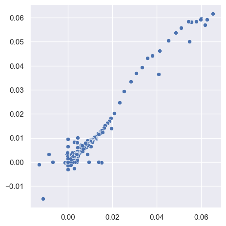
Example with numpy arrays#
You can use seaborn with matrix data but in the case of numpy arrays you don’t get quite as much benefit. The colors and styles are nice but you don’t get the axis lables with just a matrix of data.
relplotdocs page
band_100_135 = bands[:, 100, 135]
band_200_330 = bands[:, 200, 330]
sns.relplot(x=band_100_135, y=band_200_330)
/Users/rwegener/miniconda3/envs/sarp/lib/python3.10/site-packages/seaborn/axisgrid.py:118: UserWarning: The figure layout has changed to tight
  self._figure.tight_layout(*args, **kwargs)
<seaborn.axisgrid.FacetGrid at 0x164de1b70>
Customizing#
Because seaborn is built on top of matplotlib, you can still choose to customize the plots with the same commands as matplotlib.
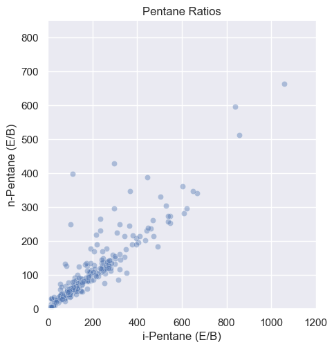
sns.relplot(data=was_2020_subset, x='i-Pentane (E/B)', y='n-Pentane (E/B)', alpha=0.4)
plt.title('Pentane Ratios')
plt.xlim(0, 1200) # change the x axis range
plt.ylim(0,850)  # change the y axis range
/Users/rwegener/miniconda3/envs/sarp/lib/python3.10/site-packages/seaborn/axisgrid.py:118: UserWarning: The figure layout has changed to tight
  self._figure.tight_layout(*args, **kwargs)
(0.0, 850.0)