Time Series Statistics#
Content
Load in your data
Plotting a time series
Cumulative Sum
Kendall’s Tau
Theil Sen Estimator
1) Load in your data with pandas#
import pandas as pd
gauge_data = pd.read_csv('englewood_3_21_21_usgs_modified.csv')
# If your file doesn't read in that easily you might also try using additional flags such as
pd.read_csv('englewood_3_21_21_usgs_modified.csv', header=1) # specify header row
pd.read_csv('englewood_3_21_21_usgs_modified.csv', skiprows=10) # ignore some rows at the top of the file
| USGS | 6711565 | 2021-03-12 02:15 | MST | 44.5 | 8 | 8.2 | 8.1 | |
|---|---|---|---|---|---|---|---|---|
| 0 | USGS | 6711565 | 2021-03-12 02:30 | MST | 44.5 | 7.9 | 8.0 | 8.1 |
| 1 | USGS | 6711565 | 2021-03-12 02:45 | MST | 44.5 | 7.9 | 7.9 | 8.1 |
| 2 | USGS | 6711565 | 2021-03-12 03:00 | MST | 44.5 | 7.8 | 8.0 | 8.1 |
| 3 | USGS | 6711565 | 2021-03-12 03:15 | MST | 44.5 | 7.8 | 8.0 | 8.1 |
| 4 | USGS | 6711565 | 2021-03-12 03:30 | MST | 44.5 | 7.7 | 8.0 | 8.1 |
| ... | ... | ... | ... | ... | ... | ... | ... | ... |
| 131 | USGS | 6711565 | 2021-03-13 11:15 | MST | 42.6 | 6.7 | 9.8 | 7.9 |
| 132 | USGS | 6711565 | 2021-03-13 11:30 | MST | 42.6 | 6.7 | 9.9 | 7.9 |
| 133 | USGS | 6711565 | 2021-03-13 11:45 | MST | 42.6 | 6.7 | 10.2 | 7.9 |
| 134 | USGS | 6711565 | 2021-03-13 12:00 | MST | 46.5 | 6.7 | 10.3 | 7.9 |
| 135 | USGS | 6711565 | 2021-03-13 12:15 | MST | NaN | 6.6 | 10.3 | 7.9 |
136 rows × 8 columns
We see we have a pandas DataFrame with rows corresponding to 146 times and several data columns, the interesting ones being Discharge, Temperature, Dissolved oxygen and pH.
gauge_data
| agency_cd | site_no | datetime | tz_cd | Discharge | Temperature | Dissolved oxygen | pH | |
|---|---|---|---|---|---|---|---|---|
| 0 | USGS | 6711565 | 2021-03-12 00:00 | MST | 44.5 | 8.1 | 8.3 | 8.1 |
| 1 | USGS | 6711565 | 2021-03-12 00:15 | MST | 44.5 | 8.1 | 8.2 | 8.1 |
| 2 | USGS | 6711565 | 2021-03-12 00:30 | MST | 44.5 | 8.1 | 8.2 | 8.1 |
| 3 | USGS | 6711565 | 2021-03-12 00:45 | MST | 44.5 | 8.1 | 8.1 | 8.1 |
| 4 | USGS | 6711565 | 2021-03-12 01:00 | MST | 44.5 | 8.1 | 8.1 | 8.1 |
| ... | ... | ... | ... | ... | ... | ... | ... | ... |
| 141 | USGS | 6711565 | 2021-03-13 11:15 | MST | 42.6 | 6.7 | 9.8 | 7.9 |
| 142 | USGS | 6711565 | 2021-03-13 11:30 | MST | 42.6 | 6.7 | 9.9 | 7.9 |
| 143 | USGS | 6711565 | 2021-03-13 11:45 | MST | 42.6 | 6.7 | 10.2 | 7.9 |
| 144 | USGS | 6711565 | 2021-03-13 12:00 | MST | 46.5 | 6.7 | 10.3 | 7.9 |
| 145 | USGS | 6711565 | 2021-03-13 12:15 | MST | NaN | 6.6 | 10.3 | 7.9 |
146 rows × 8 columns
Note
A Note about using pandas
You get data from a single column using the following notation:
gauge_data['Discharge']
This will be helpful while plotting.
2) Plotting a time series#
import matplotlib.pyplot as plt
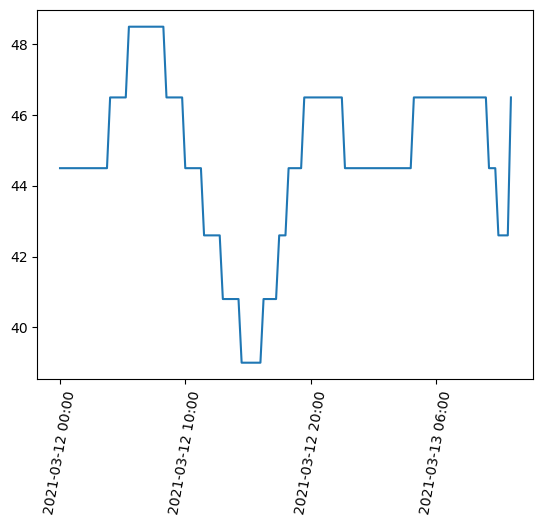
There are two plots below. Plot 1 is the simpliest way to make a plot. Because with my data I have a lot of x axis labels and they are over lapping eachother in plot 2 I add some code to format my x labels to make them nicer. For your data I would start with the technique in Plot 1 and only use the Plot 2 axis labels code if your x axis labels are hard to read.
The plotting methods will work for lots of types of python data (i.e. anything that is an numpy array).
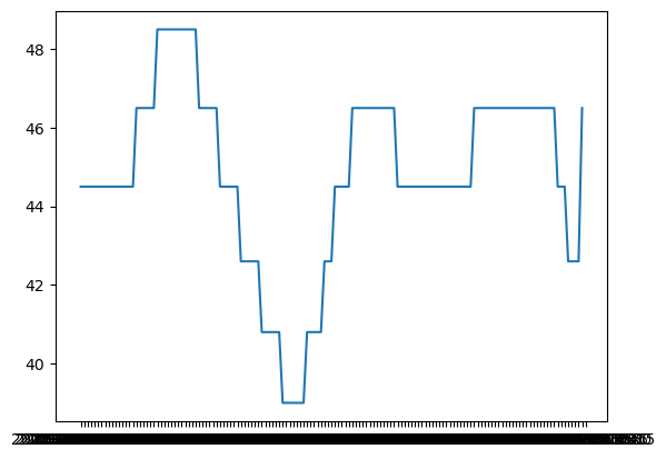
# Plot 1
# inputs: x values, y values
plt.plot(gauge_data['datetime'], gauge_data['Discharge'])
[<matplotlib.lines.Line2D at 0x1592f8400>]
# Plot 2
# inputs: x values, y values
plt.plot(gauge_data['datetime'], gauge_data['Discharge'])

ax = plt.gca()
ax.xaxis.set_major_locator(plt.MaxNLocator(5))  # Use only 4 labels
ax.tick_params(axis='x', labelrotation = 80)  # Rotate the labels so the are more vertical
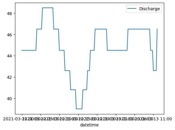
Optional Extra: A pandas-specific way to plot#
This plotting method is faster but only works for pandas dataframes. The benefit is that you get the lagend automatically.
# Plot 1
# inputs: x column name, y column name
gauge_data.plot('datetime', 'Discharge')
<Axes: xlabel='datetime'>
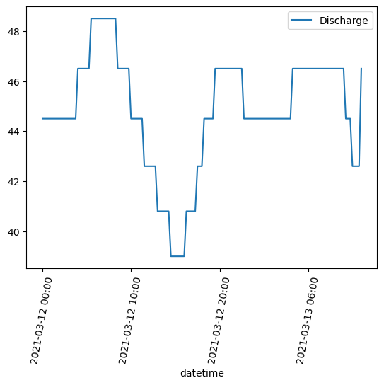
# Plot 2
# inputs: x column name, y column name
gauge_data.plot('datetime', 'Discharge')

ax = plt.gca()
ax.xaxis.set_major_locator(plt.MaxNLocator(5))  # Use only 4 labels
ax.tick_params(axis='x', labelrotation = 80)  # Rotate the labels so the are more vertical
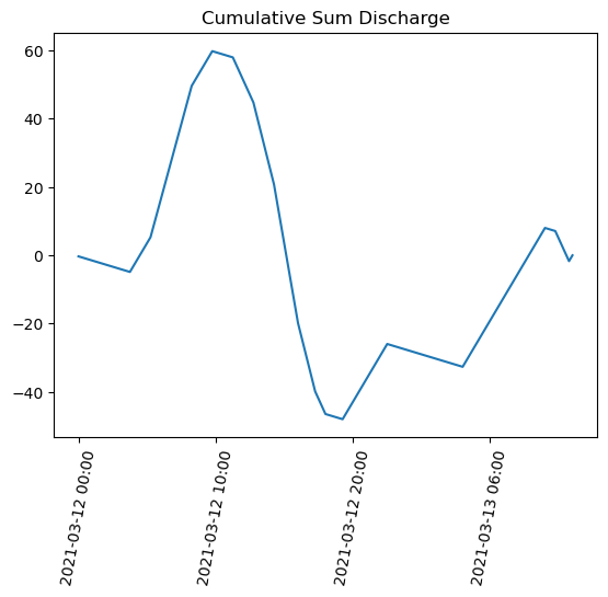
3) Cumulative sum#
Subtracting the mean value as a baseline#
In Raphe’s examples the mean value of a large value was used as the baseline and then used to compute the anomaly of each value. Here we use the mean of our dataset (even though the record isn’t that long, hopefully it conveys the idea).
baseline_discharge = gauge_data['Discharge'].mean()
gauge_data['discharge_anomaly'] = gauge_data['Discharge'] - baseline_discharge
gauge_data['discharge_anomaly']
0     -0.304138
1     -0.304138
2     -0.304138
3     -0.304138
4     -0.304138
         ...
141   -2.204138
142   -2.204138
143   -2.204138
144    1.695862
145         NaN
Name: discharge_anomaly, Length: 146, dtype: float64
Compute the cumulative sum#
import numpy as np
# inputs: the data variable you want to sum
discharge_csum = np.cumsum(gauge_data['discharge_anomaly'])
discharge_csum
0     -3.041379e-01
1     -6.082759e-01
2     -9.124138e-01
3     -1.216552e+00
4     -1.520690e+00
           ...
141    2.712414e+00
142    5.082759e-01
143   -1.695862e+00
144    5.684342e-14
145             NaN
Name: discharge_anomaly, Length: 146, dtype: float64
Plot the cumulative sum#
import matplotlib.pyplot as plt
plt.title('Cumulative Sum Discharge')
# inputs: x values, y values
plt.plot(gauge_data['datetime'], discharge_csum)

ax = plt.gca()
ax.xaxis.set_major_locator(plt.MaxNLocator(5))  # Use only 4 labels
ax.tick_params(axis='x', labelrotation = 80)  # Rotate the labels so the are more vertical
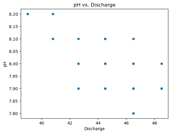
Kendall’s Tau#
from scipy import stats
# inputs: variable 1, variable 2, (OPTIONAL nan_policy if your dataset has nan values)
tau, p_value = stats.kendalltau(gauge_data['Discharge'], gauge_data['pH'], nan_policy='omit')
print('tau: ', tau, ' p_value: ', p_value)
tau: -0.5386593699749752 p_value: 1.1943988281013273e-14
Scatter plot of the Discharge and pH#
gauge_data.plot.scatter('Discharge', 'pH')
plt.title('pH vs. Discharge')
Text(0.5, 1.0, 'pH vs. Discharge')
Theil Sen Estimator#
from scipy import stats
If needed drop rows with nans
gauge_data = gauge_data.dropna(subset=['Discharge', 'pH'])
Compute the slope values for the best fit line and confidence interval lines.
Output res returns four values:
slope of the Theil line
intercept of the Theil line
slope of lower bound of confidence on the Theil line
slope of upper bound of confidence on the Theil line
# inputs are: y variable, x variable, confidence interval (value between 0 and 1)
res = stats.theilslopes(gauge_data['pH'], gauge_data['Discharge'], 0.90)
# Here I used the index as a replacement for time
print(res)
TheilslopesResult(slope=-0.02702702702702691, intercept=9.202702702702698, low_slope=-0.03636363636363624, high_slope=-0.02564102564102556)
Plot the lines#
import matplotlib.pyplot as plt
Use the slope and y intercept values from the stats.theilslopes() method and plot the lines using the form y = b + m*x
# Inputs for all plots: x values, y values, (optional color preferences)
# base scatter plot
plt.scatter(gauge_data['Discharge'], gauge_data['pH'])
# Theil slope
plt.plot(gauge_data['Discharge'], res[1] + res[0]*gauge_data['Discharge'], color='red')
# lower confidence line
plt.plot(gauge_data['Discharge'], res[1] + res[2]*gauge_data['Discharge'], '--k')
# upper confidence line
plt.plot(gauge_data['Discharge'], res[1] + res[3]*gauge_data['Discharge'], '--k')
[<matplotlib.lines.Line2D at 0x15c5f5870>]
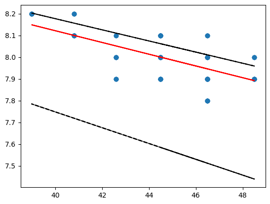
More color preferences for the plot are listed in the “Notes” section of the plt.plot docs.