Cartopy with gridded data#
This example demonstrates:
plotting gridded data with cartopy
reprojecting a map
setting a nodata value to render as a different color
import xarray as xr
import matplotlib.pyplot as plt
import cartopy.crs as ccrs
sst_ds = xr.open_dataset('../lessons/gridded_data/data/oisst-avhrr-v02r01.20220304.nc')
sst = sst_ds.sst.isel(zlev=0)
# Preprocessing - convert longitude to -180 -> 180 degrees
sst['lon'] = (sst['lon'] + 180) % 360 - 180
sst = sst.sortby(sst.lon)
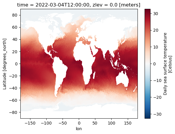
Quick plots with xarray#
# Selecting one time step to plot
sst.isel(time=0).plot()
<matplotlib.collections.QuadMesh at 0x16772b5e0>
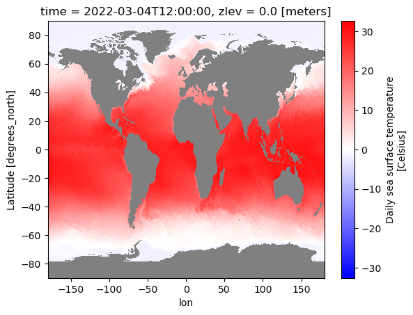
Set the nodata value to grey#
“bwr” is the name of the colormap that I chose for this image. You can change “bwr” to any other colormap you want. Ex. plt.cm.get_cmap("viridis").copy()
Grey can also be changed to any color. I like using grey because it is clear, but I often prefer a slightly lighter shade than the default, so I’ll use the hexadecimal code #c0c0c0. (Example below in a comment)
# Extract the colormap that I want "bwr"
bwr_badgrey = plt.cm.get_cmap("bwr").copy()
bwr_badgrey.set_bad('grey')
# bwr_badgrey.set_bad('#c0c0c0')
/var/folders/p8/985fq4dx1356qtcv5dd4zgyr0000gn/T/ipykernel_20757/1320405681.py:2: MatplotlibDeprecationWarning: The get_cmap function was deprecated in Matplotlib 3.7 and will be removed two minor releases later. Use ``matplotlib.colormaps[name]`` or ``matplotlib.colormaps.get_cmap(obj)`` instead.
  bwr_badgrey = plt.cm.get_cmap("bwr").copy()
sst.isel(time=0).plot(cmap=bwr_badgrey)
<matplotlib.collections.QuadMesh at 0x1681fada0>
More detailed plots with cartopy#
# Set the projection. PlateCarree is "regular" lat/lon
map_proj = ccrs.PlateCarree()
data_proj = ccrs.PlateCarree()
sst_AK = sst.sel(lon=slice(-180, -120), lat=slice(40, 75)).isel(time=0)
sst_AK.plot()
<matplotlib.collections.QuadMesh at 0x16830c820>
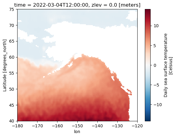
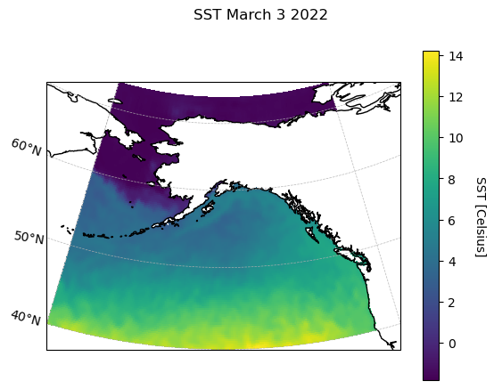
fig = plt.figure()
ax = plt.axes(projection=map_proj)

# Add the data to the plot
pc = ax.pcolormesh(sst_AK.lon, sst_AK.lat, sst_AK, transform=data_proj)

# Add gridlines
gl = ax.gridlines(draw_labels=True, linewidth=0.5, linestyle='--', alpha=0.9)
gl.top_labels, gl.right_labels = False, False
# the previous line to removes top and right gridlines labels, which overlap
# the colorbar

# Add the colorbar
cb = fig.colorbar(pc, extend='neither')
cb.set_label('SST [Celsius]', rotation=270, labelpad=18)

# Add a title
fig.suptitle('SST March 3 2022')

# Add coastlines
ax.coastlines()
<cartopy.mpl.feature_artist.FeatureArtist at 0x167fd9f60>
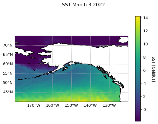
Transforming the map to another projection#
Alaska is pretty far north, so we may want to use a map projection that is more accurate for that region. Looking through the cartopy projection list it looks like an Albers Equal Area projection minimizes distortion in northern latitudes, so let’s use that one.
# Define a new map projection
map_proj = ccrs.AlbersEqualArea(central_longitude=-150)
Copy and paste the exact same code as above
fig = plt.figure()
ax = plt.axes(projection=map_proj)

# Add the data to the plot
pc = ax.pcolormesh(sst_AK.lon, sst_AK.lat, sst_AK, transform=data_proj)

# Add gridlines
gl = ax.gridlines(draw_labels=True, linewidth=0.5, linestyle='--', alpha=0.9)
gl.top_labels, gl.right_labels = False, False
# the previous line to removes top and right gridlines labels, which overlap
# the colorbar

# Add the colorbar
cb = fig.colorbar(pc, extend='neither')
cb.set_label('SST [Celsius]', rotation=270, labelpad=18)

# Add a title
fig.suptitle('SST March 3 2022')

# Add coastlines
ax.coastlines()
<cartopy.mpl.feature_artist.FeatureArtist at 0x16838beb0>
Much less distorted!